


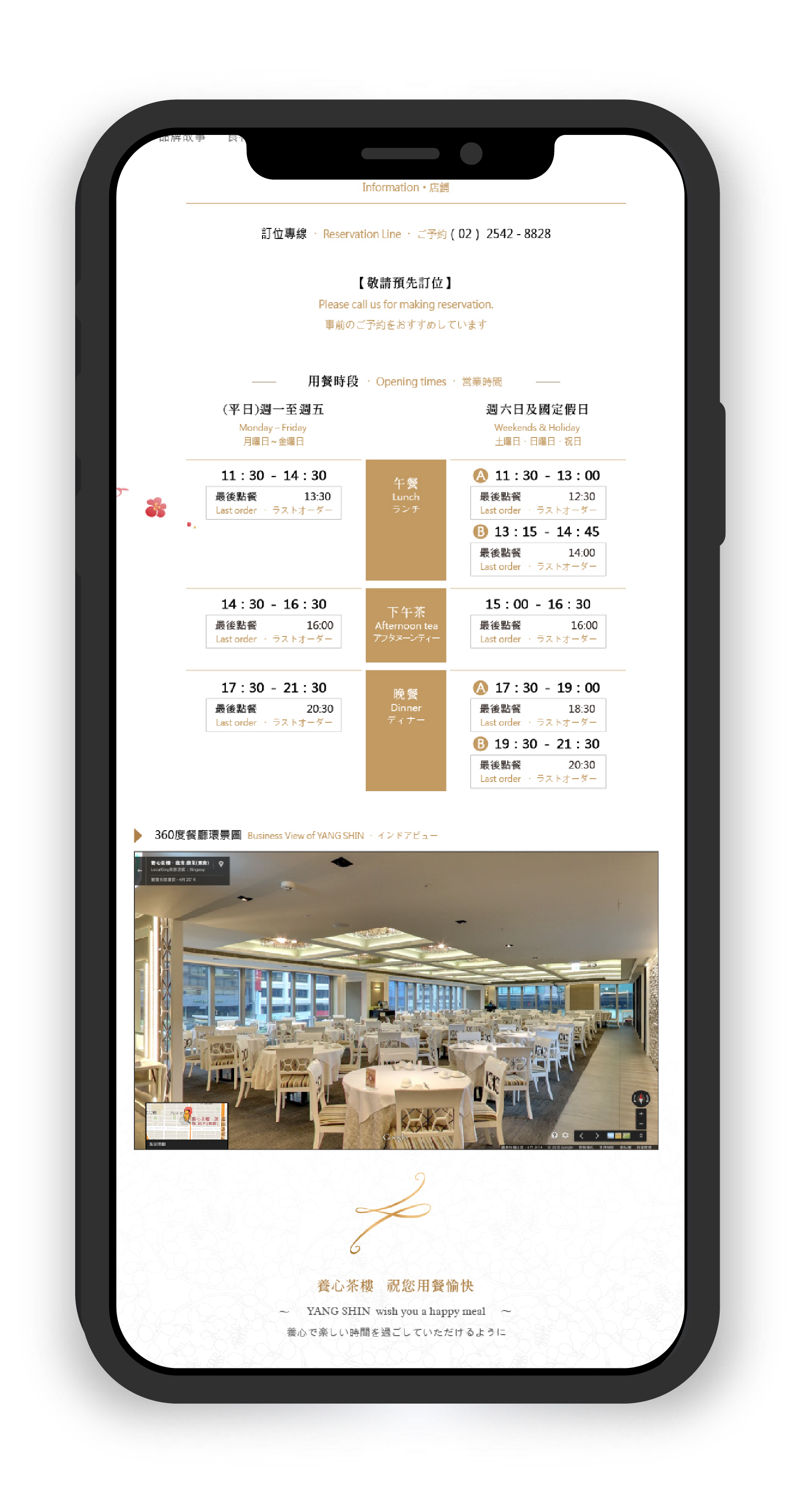
Yang Shin Tea House is a premium tea brand with a strong emphasis on craftsmanship, visual refinement, and product storytelling.
From an engineering perspective, the project involved multiple constraints:
This project could not be solved with an off-the-shelf e-commerce template.
The combination of rich visual composition, long-form content, and brand-specific layout requirements meant that template-based systems would either break under content changes or require extensive overrides.
Instead, the site was designed as a custom front-end structure built to support evolving content and visual density from the outset.
The design intent emphasized calmness, spacing, and visual rhythm—qualities that can easily conflict with engineering stability if not carefully structured.
Early in the process, I evaluated which visual elements were essential to the brand experience and which could introduce unnecessary technical complexity. This grounded design decisions in engineering feasibility and prevented late-stage compromises.
The front-end architecture was built around semantic HTML and modular CSS, treating layout as a system rather than a collection of individual pages.
Content blocks, imagery, and typography were intentionally decoupled to ensure that changes in content length or media assets would not disrupt layout behavior as the site evolves.


Beyond layout and visual considerations, several programming-level challenges emerged during implementation—primarily related to state handling, scalability, and long-term maintainability.
Rather than adding complexity through frameworks or libraries, I focused on solving these challenges with minimal, well-scoped JavaScript logic and clear structural boundaries.
The site shares a single navigation structure across desktop and mobile, but interaction patterns differ significantly between the two. Without careful handling, this can lead to duplicated markup or inconsistent active states.
Solution
I implemented a centralized state-handling approach using vanilla JavaScript to manage navigation toggles and active states. By keeping the logic independent from layout structure, both desktop and mobile views could share the same underlying behavior without branching logic or duplicated DOM elements.
This reduced maintenance overhead and ensured consistent navigation behavior as pages were added or restructured.
In visually rich layouts, it is tempting to rely on JavaScript to control visibility, spacing, or layout transitions. However, this often leads to tight coupling between content structure and interaction logic.
Solution
I deliberately avoided using JavaScript for layout control. Core structure and responsive behavior were handled entirely through CSS, while JavaScript was limited to state indication and user feedback.
This separation ensured that future content or layout changes would not require rewriting interaction logic, significantly reducing the risk of cascading updates.
With long-scroll pages and content-heavy sections, scroll-based interactions can quickly become performance bottlenecks if not handled carefully.
Solution
I implemented lightweight, condition-based scroll logic only where it improved usability—such as contextual “Back to Top” behavior—while avoiding continuous animation or scroll-bound calculations.
This approach improved navigation comfort without introducing unnecessary event listeners or repaint overhead.
E-commerce content evolves over time—product descriptions grow longer, categories expand, and media assets change. Hard-coded assumptions can quickly break interaction logic.
Solution
All JavaScript logic was written with content variability in mind, avoiding assumptions about element count, text length, or fixed positioning. Interaction behavior was scoped to roles and states rather than specific content instances.
As a result, new content could be added without modifying existing scripts.
Not every interaction improves usability. Over-engineered behaviors can increase cognitive load for users and technical debt for developers.
Solution
I intentionally limited interactive features to those that directly supported navigation clarity or task completion. Visual polish was achieved primarily through layout, typography, and spacing rather than scripted effects.
This kept the JavaScript layer concise, readable, and easy to hand off or extend in the future.
Because I owned both design and front-end implementation, engineering constraints informed design decisions early in the process.
This feedback loop ensured alignment between visual intent, interaction cost, and long-term maintainability throughout the project lifecycle.
With additional time or data, I would further refine performance monitoring under real traffic conditions and optimize content-loading strategies based on user behavior.
Role
Front-End Engineer · Product Designer
Tools
HTML / CSS · JavaScript
Cross-device testing (Desktop · Tablet · Mobile)
This project reflects my approach as a front-end–oriented product designer: translating visual intent into stable, scalable, and maintainable front-end systems for real-world commercial use.


